
ACD Fitness
UI Design
A premium fitness experience
Role
UI Designer
Tools
Figma
Timeline
April 2024
Overview
The design concept was born out of a desire to elevate visual branding standards in the fitness community. The objective was to ignite a sense of luxury in the fitness realm, recognizing that numerous gyms are high-priced without offering a compelling visual identity to match.
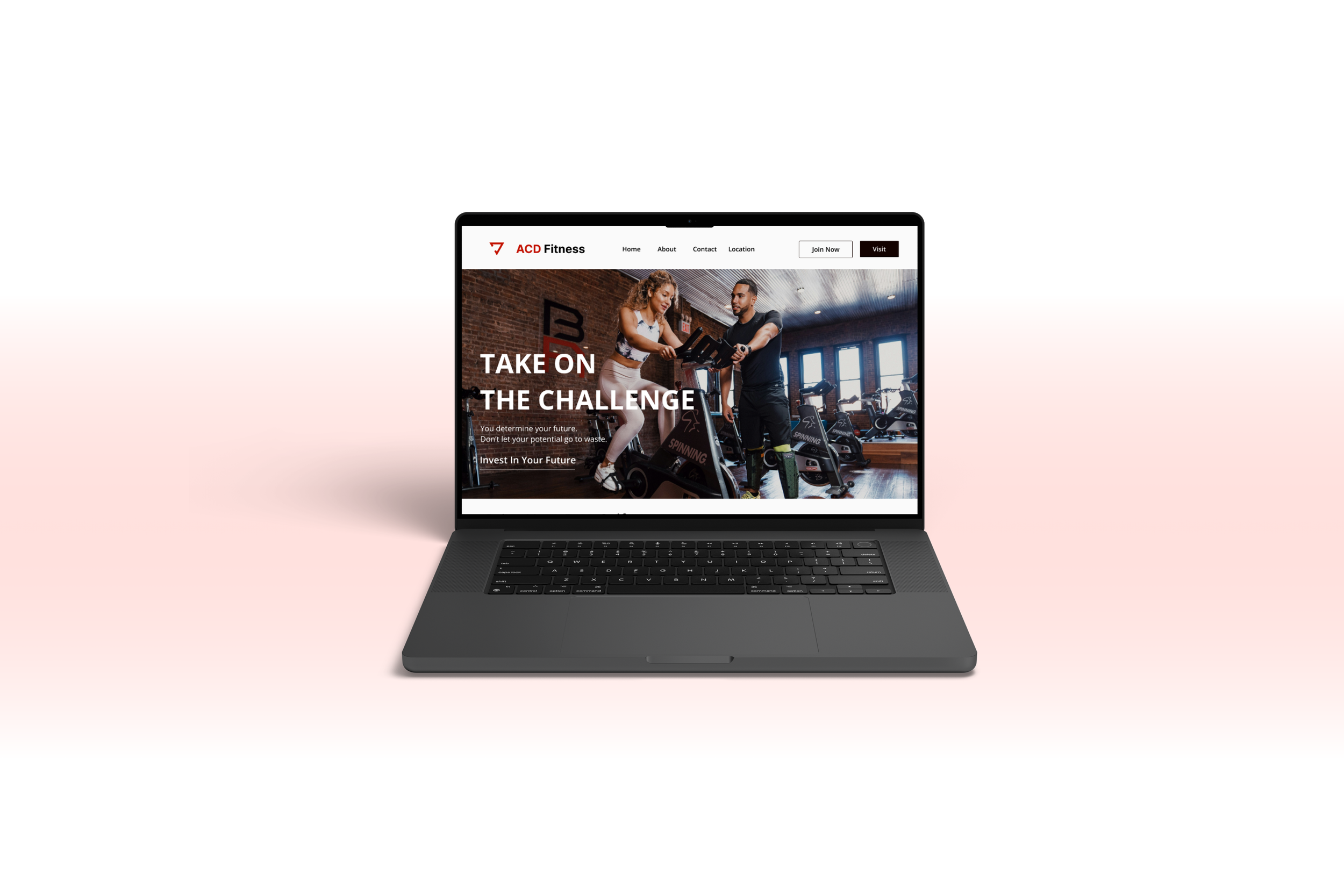
What is the visual appearance of the homepage of a high-end gym's website?
Solution
A homepage that promotes challenge and self-improvement, with a subscription service that is more expensive than competitors and with gyms in top locations.
Visual Interface
Visual Identity
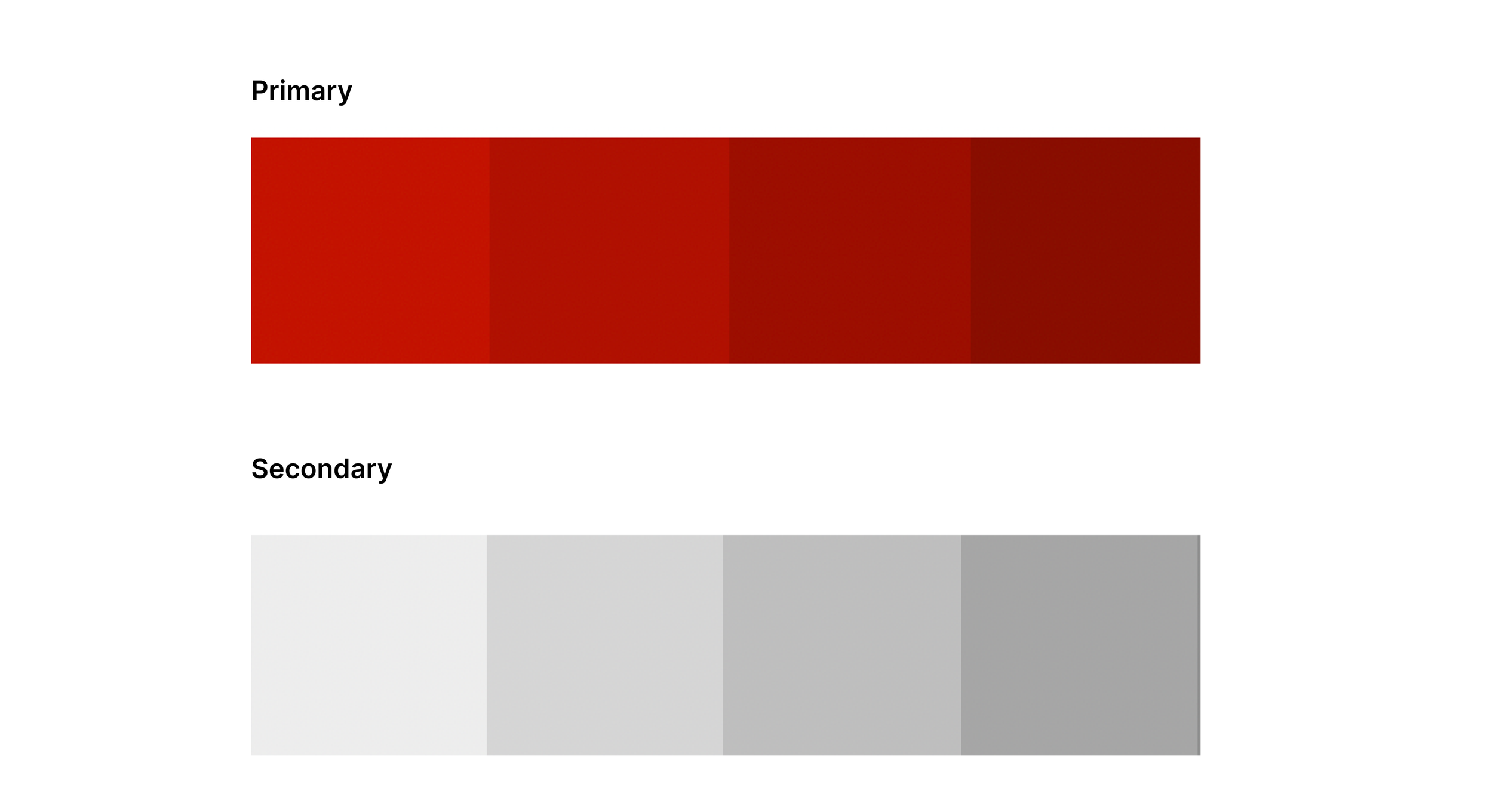
The ACD Fitness color scheme shows passion and liveliness, capturing the brand's vibrant vibe. Bright bold colors mixed with gray accents create a sleek look blending energy and class.
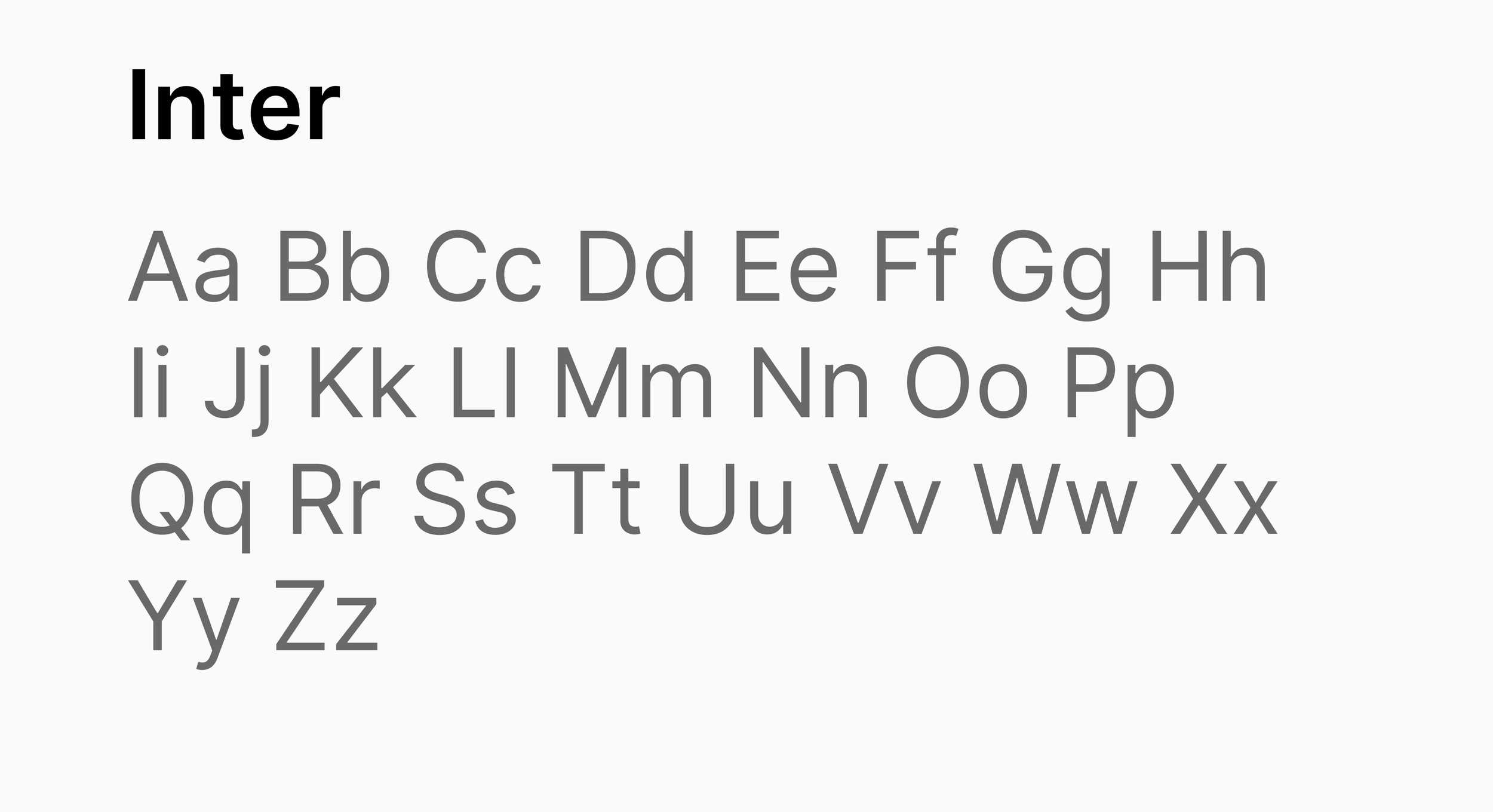
Inter was selected for its timeless, modern sophistication, making it the perfect choice as a classic font for the brand.
Prototype Phase
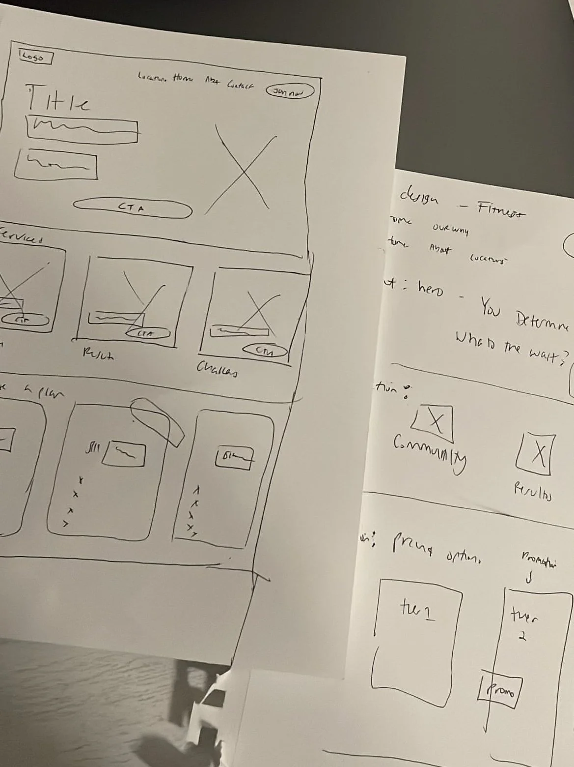
Low Fidelity
The rough paper sketches were completed, drawing inspiration from various common gym websites.

High Fidelity Prototype
Key Takeaway
A premium isn't just about the price tag attached to it; it extends to visual marketing as well. The imagery, colors, and tone utilized play a crucial role in shaping a distinctive user experience.